The Publishing Journey: Step 3 – Design a Cover
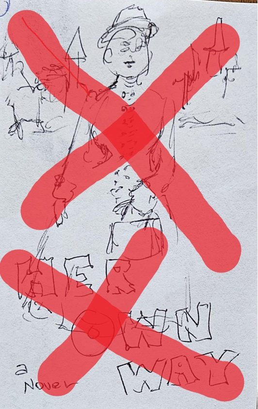
I had a title for my novel. “Her Own Way”. I thought this indicated clearly that the book is about a woman, one who carves her own path rather than meeting the expectations of others. Would you want to read that book?
My publisher’s crew did not like that title. “Too generic” they said. They gave me some other choices:
The Liberation of Nellie Young
The Many Lives of Nellie Young
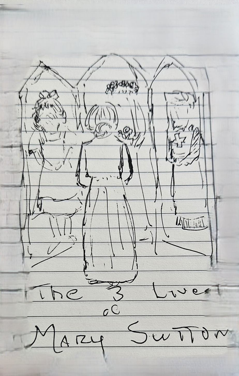
The Three Lives of Mary Sutton
The Sutton Sisters
I had jokingly suggested that “I led Three Lives” would have been a good title for the book if that title had not been claimed already by a long-running TV series (though few of my prospective readers would ever have head of it.) So I went with Option 3.
I had suggested that I wanted a picture of the great-grandmother who inspired my novel on the cover. the publishing crew seemed amenable, and Isent two different photos. Sorry, these are not in the required high-definition format and would look pixilated on the cover – ok if this were a Sci-fi novel but not for a historical.
Fortunately, I have a friend who worked for Adobe and knows all about creating a 300 dpi photo file fro a 150 dpi scanned image. I scanned the photos on my home multi-function printer and Jim transformed the scanner’s output into the required format. Hurdle overcome. Enhanced versions sent.
Sorry. After several tries, the publisher’s crew of artists communicated that it would not be possible to make a cover that was properly eye-catching using the historic photos. The one I liked had too much old-=fashioned detail (a chair, a fern) and could not be cropped. The other one was possible, but they could not figure out how to make her static figure look dynamic against a historic street scene. And the whole effect was too busy.
In several exchanges of letters, I was educated in the new requirements of cover design.
Most importantly, the cover needs to convey its message when shrunk to a dimension about the size of a large postage stamp.
*This is the size which will be displayed in print inserts to local newspapers from local bookstores.
* This is the size which will appear in print advertising in magazines such as my University’s alumni magazine or in “Wirter’s Digest” or in the New York Review of books. And above all
*This is the size which will appear on a potential reader’s phone or tablet when he/she clicks through Amazon looking for something of interest.
The artists sent four suggestions:
One simply showed a woman’s expressionless face. What does that tell you? Not that one.
One showed a woman from the back, wearing a long black dress, arms pressed close to her sides, her hair in a severe bun. She looked like Morticia. Why would you want to read about her? Not that one.
One showed a rather plain young girl dressed again in a long black dress, looking sadly out of a window. No fun.
The fourth was ok. I sent a note indicating that I thought this was the best of the four. To my dismay, the team took this to be a full approval . I had expended energy already over my photo failure, and did not demur, as I had no alternative suggestion prepared.
Of course, a week or so later I had all sorts of better ideas for the cover, but that ship had sailed. Maybe when the book goes to its second printing? (Ha! In your dreams – but why not dream?)
No, I’m not showing you the actual cover. Apparently the “cover reveal” is a big deal later in the process. Stand by.

What a journey you are on. Thanks for sharing.
Cindy
LikeLike
Great blog, Allyson. I’m on a similar journey and you describe the twists and turns very well. I never thought all that deeply about book covers before needing to pick one for my own novel; I just responded to them and valued the ones that went to my heart ,or seemed beautiful or vivid. But it’s great for new authors to have your thoughtful descriptions of the process, and for non-authors I imagine interesting to know how much goes into an author landing on and negotiating a book cover with a publisher– even one as flexible as She Writes Press!
LikeLike